Is there anything better than getting your new set of embroidery thread cones out for the first time? There are so many different colours, and they are so shiny. What should I do with them all? People who embroider get overwhelmed by the hundreds of colours they can choose from. Even if they pick colours they think look good together, there can still be a sense of something missing.
Here, we're going to learn a little more about colour theory. It may sound dull, but it's actually very interesting, and you should check it out. Plus, with a little background, you can choose a colour scheme that fits together and has the right accents. We'll talk about:
- Color theory history; why are specific colors used over others.
- Color terminology; knowing terminology will give you a good understanding of color theory more effectively.
- Color harmony; why is the color wheel so important?
- Color theory for machine embroidery; how to determine proper colors for color blending in your embroidery designs.
Color Theory History
There is a lot more to colour theory than you might think. The ancient Greeks thought that different colours had different meanings, and the gleaming white buildings and statues we see today were once painted with a lot of colour.
In 632 BCE, Aristotle wrote about colour theory and how colours could be mixed together to make other colours. When Leonardo DaVinci was writing in his notebooks in 1490, he talked a lot about colour and how light makes things look. Isaac Newton wrote about the nature of the three primary colours (red, blue, and yellow) in 1704, and it caused a lot of people to talk about it then. Newton, in fact, came up with the colour wheel we know today, and he made it.
Many people, from poets to artists to even philosophers, have written about colour. This is what Goethe wrote about colour and how it affects mood and how people see things. Color can be used to make us feel comfortable, excited, moody, sad, happy, or a lot of other things (by the way, it is no accident that emotions are assigned colors; red angry, blue sad, etc.).
To make sure that you feel the way they want, designers and architects do a lot of research today. There are a lot of restaurants that are painted red because it is rich and comfortable, and other places are painted in ways that make you feel bad so you come and leave quickly.
Modern Color History
Color was used up until the mid-1800s to accurately show what people saw. In the late 1880s, changes in the art world had a huge impact on how art looks today. Like the social movements that let people be themselves, the painting movement called Expressionism wanted to make art that made people feel something, not just record what they saw. Because of this, you might see a painting that is blue and gloomy, angry and red, with distorted figures and splashes of colour.
Color Terminology
- Saturation: A way to show how intense, rich, or vivid a colour is, or how many different shades there are. Most colours are in their most saturated form when they come out of a tube. When you mix them with other colours, they become less saturated.
- Hue: Refers to where a colour is on the colour wheel.
- Tint/Shade: Color and white make tint. Shade is a colour mixed with black.
- Tone: Term for a colour that is not a pure hue and is not black or white. People use tone to describe a colour that has been greyed down.
- Value: A scale from black to white: how light or dark the colour is. In general, value is thought to be one of the most important factors in the success of a painting, and many people agree.
- Primary colors: Newton said that a primary colour is red, yellow, or blue. They are the colours that make up the whole world. These colours can't be made with other colours.
- Secondary Colors: Take two primary colours and mix them together to make another colour. So red + yellow makes orange, blue + yellow makes green, and red + blue makes purple.
- Tertiary colors: It was made by combining two other colours.
- Pantone© Color Chart: The Pantone colour chart system was started in New Jersey in the 1950s. They were made to help people print and make things the same colour.
Suppose we wanted two different companies to make bottles, labels, ads, or pictures for a soft drink. The colour chart system would make sure that all of the colours were the same. Companies that make embroidery thread use Pantone numbers, too. As long as the client wants the same colour, your stitch out colours will be the same. This is called a "stitch match."
Color Harmony
This is the colour wheel!
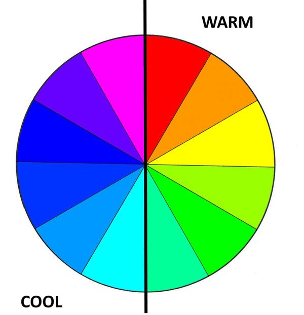
When you look at the colour wheel, you can see that it has two groups: warm and cool colours. You can make your room look more lively and interesting when you put a warm colour next to a cool one. When a cool colour is next to another cool colour, like blue and purple, it looks good and is harmonious. The idea of living in a world that was all purple and blue would be great, but it would soon get boring.
Activation is usually shown by warm colours, while light and cool colours are used to make things calm and relaxing
Neutral colours are also important, so let's talk about them. They're not beige (warm) or light blue (cool). White, black, and grey are usually thought of as neutral colours. They can be used to make tints and hues of other colours.
The following is a very interesting fact. A lot of people think that black is a colour that includes every other colour, but it is not! When it comes to colour, black means no colour, and white means all the colours are in one place. Here we are not having a physics class today. This has to do with the light spectrum, but we are not.
Highlight Colors
Highlights are the parts of an object where the light is coming from. Highlights are usually made by using the tint of the colour to make them stand out. What happens when you don't have a lot of light? Shadows are the parts of an object that don't get any light from the sun. Keep in mind that highlights don't have to be white to look good. They can come in a lot of different shades. Also, shadows can be any colour.
Lowlight Colors
The rich dark colours that are used as lowlights are the same as highlights, but they add a lot of dark colour to the hair. Most women who have had their hair dyed know this. In both hair and painting, lowlights can add depth and shadow. They're just as important as they are for hair.
Color Theory For Machine Embroidery
Then, let's use some of the above to embroider a few things. We need to remember that we can use colour to make things like colourful names on a bag or a stitched picture. Do not be afraid to try everything.
To get realistic colour schemes, look to nature. Color combinations that are interesting and exciting should be looked up to by the best. Every time we talk about master painters, we think they were born that way. In fact, they were born with great talent and a good education. Most classical artists did colour studies of people who came before them.

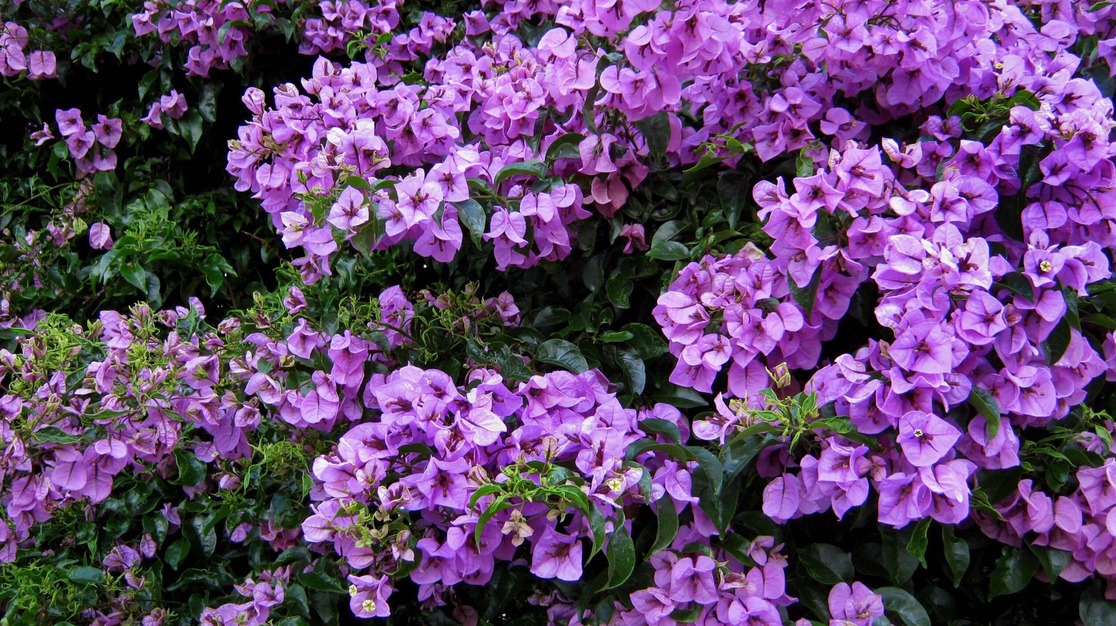
These peas are mostly green, aren't they? These colours are close to each other on the colour wheel. Lovely, but if they were the only colours in your project, it could get a little dull.
Let's add a new colour. Purple is next to green on the colour wheel, and these two colours go well together. The colours that are next to each other can be used to add life to your work. They don't have to be right next to each other, but something in the area does. It still adds a lot of energy.
Triadic Colors
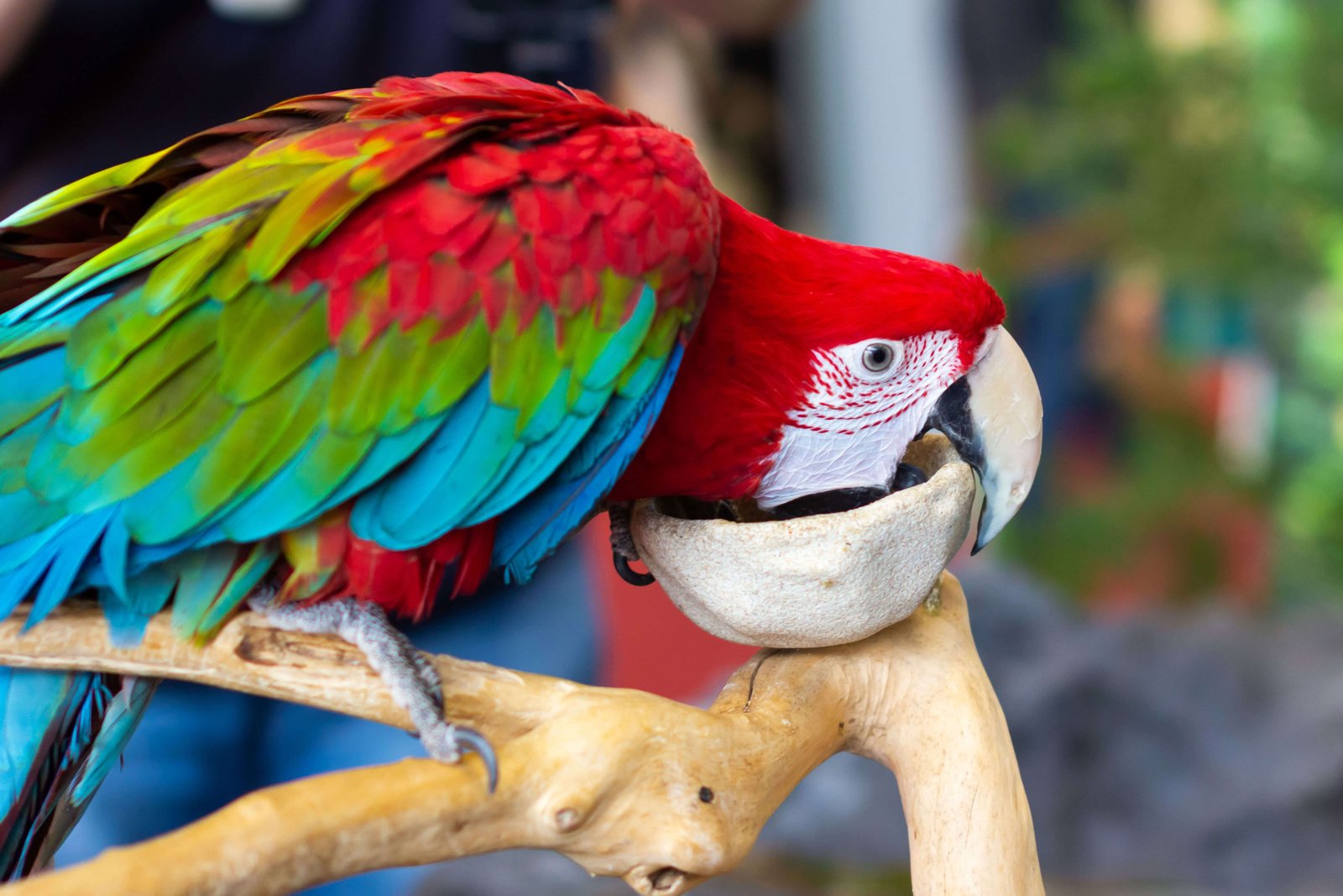
In the same way that they sound, triadic colours are in threes on the colour wheel. Adding this third colour to our painting makes it more lively and more interesting. There are a lot of triadic things in nature that are very beautiful. Among other things, these rainbow macaws look like they were made to fit in with their environment. Flowers, too, can come in a wide range of colours. These are often made so that the ultraviolet light they make attracts bugs and pollinators.
Let's move on to embroidery, because that is what we are here for.
Base Colors in Embroidery
Many of the most beautiful embroideries start with some kind of base colour, like red or blue. It may not be the same colour as the other things around and on top of it, but it ties them all together and makes them feel like they belong to each other. This is a good thing to do.
Embpunch has a lot of great designs, so let's look at some of them.
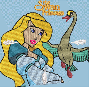
To look at the Disney collection if you haven't already, now is the time! I love the way these stitches look like they came from the old days! Why? If you didn't pick the same colour, they're all the same. In the design, beige is the main colour, and pink, white, and light blue make it come to life.
When you use color blending embroidery, you can start by laying down a large area of colour. You can make it dense or light, there's no need to make it too thick. Then, you can work your design on top of or around it. You can also use a unifying colour in large areas or accents.
If you want to make a big project like this, you need to know how to choose the right colours. It takes years, and you need to have a good eye, but there are a lot of places where you can learn about colour theory for free. You can also go outside and look at nature.
Using Pops Of Color In Embroidery
Embroidery relies on a lot of different things to make it stand out and look lively and real. Little pops of colour can add just the right touch!

This Great Dane looks so real! Of course, the stitching and texture work well together to give the fur a real-life look. When you first look at him, the colour in his eyes makes him look 3D, as well as the white/cream accents in his eyebrows.
Color pops can add life and vibrancy to your stitchouts if they are used in the right way. It's a good idea, though, to keep things simple. We don't need a lot of great things just because they are good. Pizza is a favourite of everyone, but when you eat a whole extra large pizza with a lot of toppings, your senses and stomach start to go out of their way.
To add a little colour, remove the last thing. Look away from the design and then look back. Are there too many of them?
Thread Color Blending
.png) Embroidery of a Frogmouth is a good example of how to mix different colours together. There are shades and tints, as well as tones (add another colour) that make this little guy look real. It is almost all one colour, but there are shades and tints, as well as tones (add another colour). It also helps him blend in with the people around him. Some animals want to be seen, but not all of them. If you blend, it doesn't have to be all the same colour. It can be rich and delicious!
Embroidery of a Frogmouth is a good example of how to mix different colours together. There are shades and tints, as well as tones (add another colour) that make this little guy look real. It is almost all one colour, but there are shades and tints, as well as tones (add another colour). It also helps him blend in with the people around him. Some animals want to be seen, but not all of them. If you blend, it doesn't have to be all the same colour. It can be rich and delicious!
Variegated Thread in Embroidery
You can use variegated thread, but we won't go into it too much. A lot of times, these threads can add depth to something that was lacking.
It's important to keep these things in mind when you use variegated threads:
- What colours are there? (Complimentary? Analogous?)
- Shades (add black) or Tints (add colour)? (add white)
- How many colours are there?
- I don't know. It can look like stripes if there are a lot of short repeats.
- A sudden change in colour?
Some people make Vinca flowers that are periwinkle blue and have lush green leaves. They might need some running stitch around the leaves of these flowers so that they look more like real flowers. Why not a different-colored orange? It is across from purple on the colour wheel so it will add pop and liveliness. Add a rainbow variegated thread to your project to make it come to life.
In order to buy variegated thread, the seller should give you information about the colours and the way that the colours change.
Color Palettes in Embroidery Thread
If it's possible, look at thread companies' colour palettes to see what they have to say about them. They could surprise you. Taking a look at the colours they have chosen can also teach you a lot about embroidery colour theory. These pre-chosen colours will help you learn how they look in your stitching.
Color Blending In Embroidery Digitizing
When you're digitizing realistic embroidery designs, one of the most important things you need to know is how to blend colours.
Some people choose to blend in their digitizing by hand, which is more time-consuming but gives more of an artistic flair. Others choose to do it in the software that they use to do it.
We think Hatch software is great for mixing colours and making gradients. If you buy it from Embroidery Legacy, you can try it out for free for 30 days. You can use it as if you own it, and there is no risk. That's right; you can use all of the features you would have if you owned it, too. Then, click here to sign up for a free Hatch trial and see how simple it is!
Conclusion: Apply Color Theory To Your Embroidery Designs For Results That Stand Out
Here are some of the most important points you need to remember:
- Take a look at the colour wheel. Find out about the different colours and how they can be mixed.
- Think about how you can use colour pops in your stitchings to make your work more interesting. This is how it works: Colors that are very close to the main colour or very different from it work really well!
- The colours in nature can help you think of new ways to use them.
- You may not see all of the colours you think you do (clouds)
- Some variegated thread might be fun, so have some fun!
- Look at professional designs and colour palettes from vendors to learn about new colour options.
Thank you for reading and letting us help you stitch your best. Have a fun week!