Small Text embroidery looks easy. It is not easy. It's typography and math and a little bit of stubbornness all mashed into one craft, and honestly? We're still learning new things about it. Every week, pretty much.
"90% of digitizers underestimate stabilizer thickness and using the wrong stabilizer increases thread breaks by about 45%."
Here's what nobody really tells beginners: small text embroidery isn't "pick a font, hit stitch, done." We wish. We really do. It's part design theory, part physics (thread pulls fabric, fabric pulls back, who knew), and part muscle memory that you only build by ruining a few hats first. We've digitized thousands of names, monograms, wordmarks, you name it. And we still get surprised sometimes. A design that should stitch out clean just... doesn't. And then you're back at square one, squinting at the screen going, "why."
This guide's going to take you from the very beginning, like, new to embroidery digitizing, how do I even write text?? all the way through the more technical stuff: embroidery digitizing software, stitch density, pull compensation, the whole mess. Grab a coffee. Or don't. Either way, let's get into it.
New To Embroidery... How Do I Write Text??
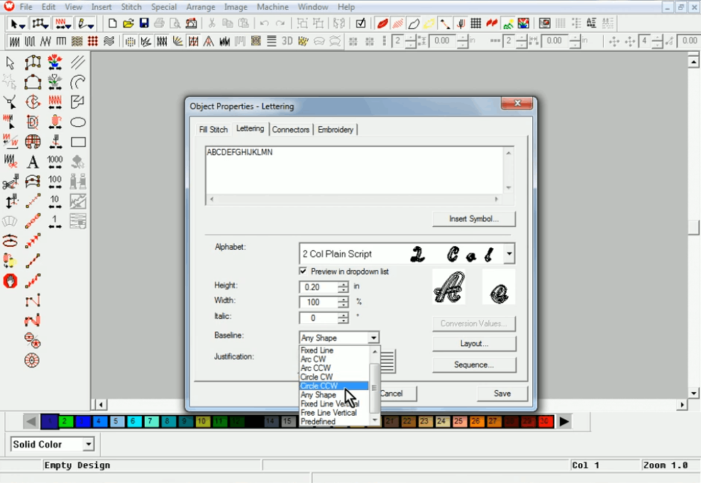
If this is you, standing in front of a hoop, totally blank, no clue where to even begin, breathe. Everybody starts exactly here. Pick one short word. Pick a basic block font. Use stabilizer. Go slow, slower than feels necessary. You are not aiming for perfection on try number one. You're aiming for "readable, mostly even, didn't cry." Perfection comes later. Usually after a dozen attempts and at least one moment of wanting to throw the whole hoop across the room.
Need a Professional Embroidery File?
If you want clean, production-ready embroidery files, Embpunch provides professional embroidery digitizing services for logos, caps, patches, jackets, polos, and more.
⭐⭐⭐⭐⭐ Trusted by embroidery professionals worldwide.
What Is Small Text Embroidery
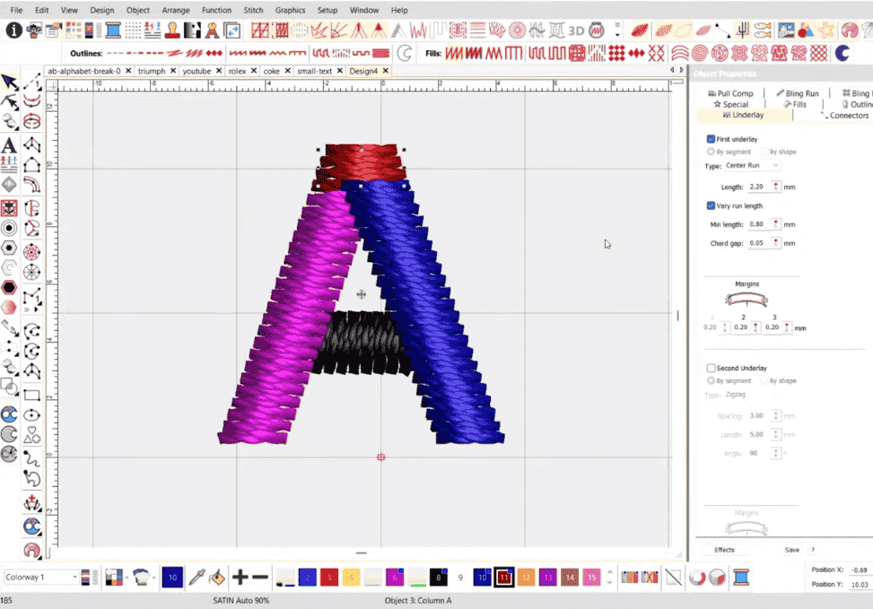
Small Text embroidery, at its core, is turning letters, words, names, whatever, into stitched-out designs on fabric. Simple sentence, sure. But underneath that sits a genuinely deep well of typography basics: font styles, kerning adjustments, stitch angles, lettering placement.
Broadly, embroidery text splits into three families, and this part actually is simple:
-
Block letters (sans serif). Clean. No little feet or flourishes. The training wheels of text embroidery, and also, plot twist, still what most professional shops rely on for 80% of their work.
-
Serif fonts. Think Times New Roman. Those tiny feet at the end of each stroke add complexity you don't notice until you're the one digitizing them.
-
Script/cursive. Gorgeous. Flowing. A nightmare for beginners because the letters melt into each other and you have to think about connections, not just shapes.
Quick Note:
We tell every single beginner the exact same thing. Once that clicks, once you actually get how a plain block letter behaves under a needle, how it can go sideways, everything else gets easier. Not easy. Easier.
How To Do Small Text Embroidery With Letters (The Part Everyone Skips)
This is the section most guides gloss over in like two sentences. We're not doing that.
Breaking Letters Into Shapes: Like X-Ray Vision, Kind Of
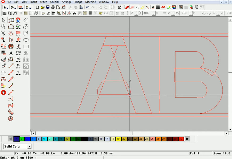
Here's a secret from the digitizing side, and it sounds weird until it clicks: no letter is actually "one piece." Ever. A capital "R"? That's two or three separate shapes, stitched in a deliberate order, overlapping just slightly where they meet.
Why should you, a person maybe hand-embroidering a monogram, care about this? Because thinking in shapes instead of whole letters saves you from that exact gap problem. Take the letter "E": a vertical bar plus three horizontal bars, basically. Break it down. Stitch each chunk. Overlap by a hair (we're talking less than a millimeter sometimes). Suddenly it reads as one clean letter instead of four floating chunks that don't quite talk to each other.
Sequencing: Or, Where Does the Needle Actually Go
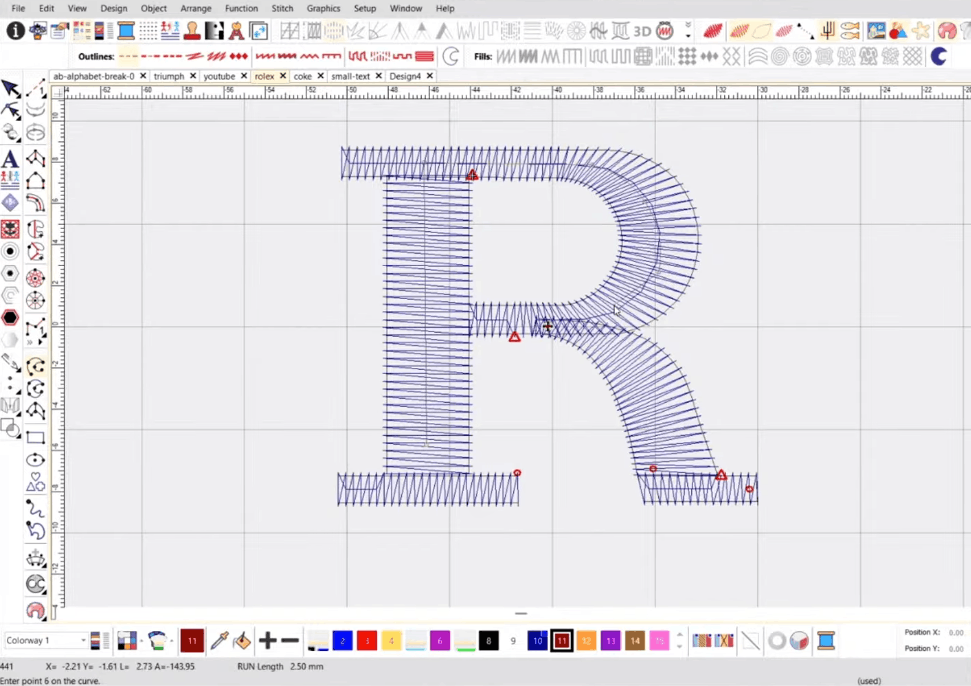
Sequencing sounds fancy. It's not. It's just: what stitches first, and where does the needle travel to next? And yet, this is the step that ruins more projects than anything else.
Important:
If your stitch order bounces around randomly, you'll end up with messy thread paths, extra unwanted trims, letters that sit slightly off from each other in a way that's hard to name but easy to see. There's a rule of thumb here, sort of: plan the shortest, most logical route between shapes. Bottoms to bottoms. Tops to tops.
Push-Pull Compensation (or: Why Your Screen Lies to You Sometimes)
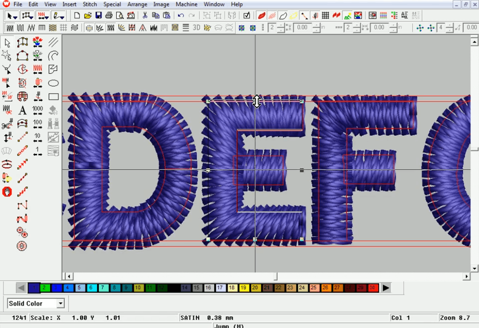
Ever notice how some professionally digitized fonts look uneven on your monitor, like one letter's floating slightly higher than its neighbor, but stitch out perfectly level on the actual garment? That's push-pull compensation.
Fabric and thread pull inward wherever a stitch begins or ends. Pushes outward on the opposite side. So online embroidery digitizers nudge certain letters up or down, tiny amounts, fractions of a millimeter, to counteract that pull before it ever happens. Skip this step and your word ends up looking like a rollercoaster. Some letters up, some down, nothing lined up the way it should be. It's a small fix. Makes an enormous difference.
How To Do Small Text Embroidery For Beginners
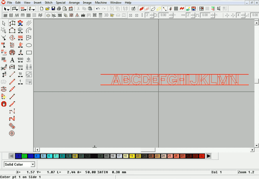
New to this? Don't overcomplicate day one. Pick one short word. Basic block font. Medium size, nothing tiny yet; save that for later once you've got some hours logged.
A few habits worth building early, in no particular order really:
-
Block letters first. We already said this. We're saying it again because it matters that much.
-
Use a pre-digitized font rather than trying to build your own from scratch. You'll get there. Not today.
-
Test on scrap fabric. We cannot stress this enough. Somebody on our team (no names) once ruined a genuinely nice hat learning this the hard way. Lesson learned. Painfully.
-
Match your hoop size to the design. A hoop that's too small for a wide word will fight you the entire time, and you will lose.
Minimum and Maximum Lettering Sizes: The Golden Rule Nobody Mentions
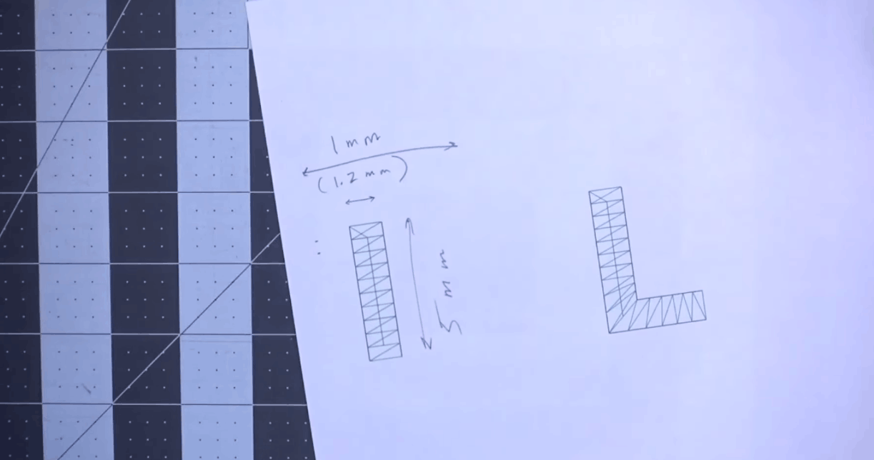
Here's a rule professional digitizers basically live and die by. It's maybe the single most useful thing in this whole article, so pay attention:
-
Minimum height: roughly 1mm to 1.2mm. Go smaller and you're gambling, thread breaks, illegible mush where letters used to be. Some people push it down to 0.8mm.
-
Maximum height (satin stitch): somewhere around 10 to 11mm. Beyond that, satin stitches stretch too long, snag on everything, lose their shape fast. Past that threshold, you switch to fill stitch instead. No way around it.
Quick Note:
Knowing these two numbers, just these two, saves you from so many frustrating back-and-forths with customers who want their logo "a little bigger" or "a little smaller, but not too small. We've heard it a thousand times.
How To DIGITIZE Text For Machine Embroidery
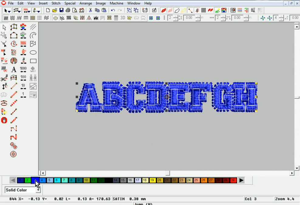
Now we're getting into the genuinely technical stuff. This is a whole separate skill from hand-stitching, honestly, like comparing a chef to someone who designs the recipe.
Digitizing Software and Keyboard Fonts
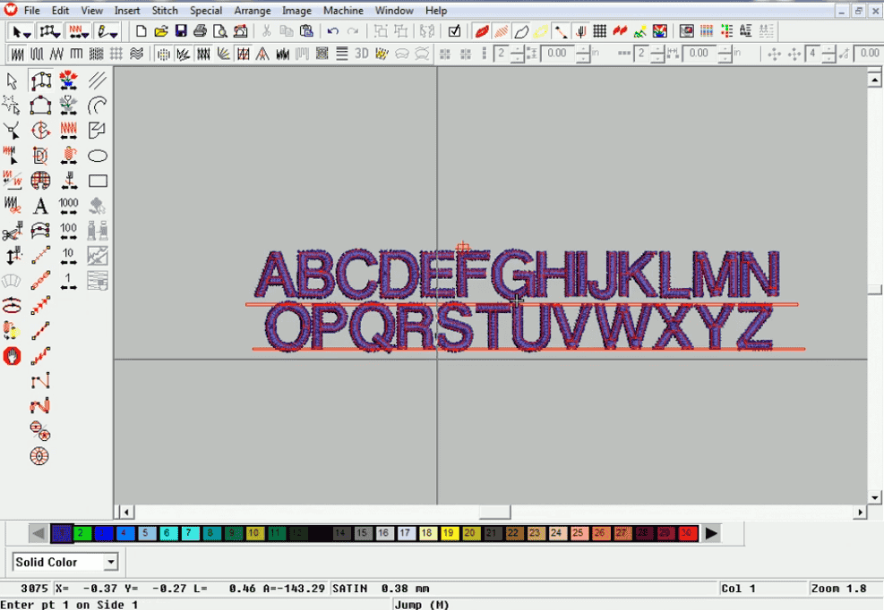
Most pros work in software like Wilcom or Hatch (there are others, sure, but these two dominate the conversation). These programs ship with libraries of "keyboard fonts", alphabets that are already digitized, push-pull and spacing and stitch angles all pre-calculated. It's a massive time-saver on anything text-heavy.
But, and this is important, keyboard fonts aren't a magic button. You still need to understand stitch density, sizing, underlay. The software gives you a head start. Not a finished product. Big difference.
Stitch Density, Underlay, and the Dreaded Satin Stitch
Stitch density is how tightly your stitches pack together. Too dense? Letters start looking bulky, almost sausage-like (yes, that's a real term people use in this industry, we didn't make it up, we promise). Too loose, and the fabric peeks through like it's embarrassed to be there.
Underlay's the foundation layer, stitched before the visible top layer, stabilizes everything, gives your satin stitch something solid to sit on. Which underlay depends heavily on stitch length:
-
Short satin stitches (under 3–4mm): a simple center run usually does the job.
-
Medium-length stitches: zigzag underlay tends to work well here.
-
Bigger lettering: combine edge run with zigzag for extra structural support.
Pull Compensation: The Small Adjustment With a Big Payoff
Small text, the needle pulls fabric inward with every single stitch, which shrinks your letters down from whatever you designed on-screen. Pull compensation just widens the satin stitch slightly to counteract that shrinkage before it happens. On tiny lettering, digitizers often bump compensation up quite a bit, going from something like 0.17mm to 0.28mm per side.
To Jump or Not to Jump
Jump stitches, the little connector threads between letters or words, are usually fine to leave alone within a single word. They're tiny; they get trimmed eventually; nobody notices. Between separate words, though, you've got a real decision to make: let the machine auto-trim (cleaner, but slower, adds real time to your stitch-out) or trim manually afterwards (faster, but takes practice to make it look anything close to tidy). Neither choice is wrong. It's mostly workflow preference and how much patience you've got left in the tank that day.
How To Embroider Letters With A Sewing Machine
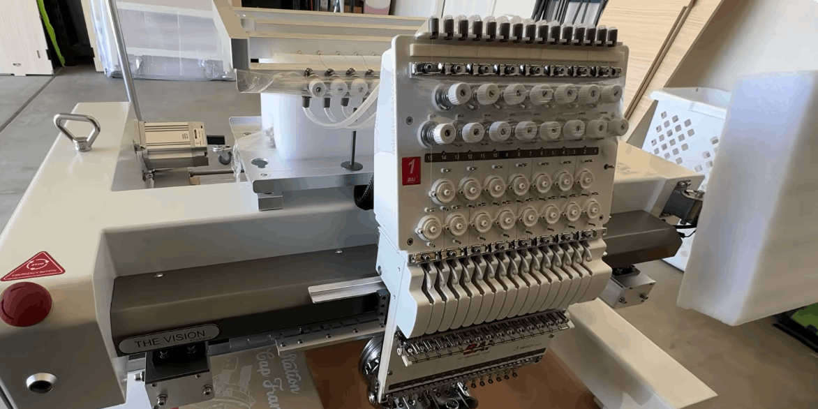
Don't own a dedicated embroidery machine? Fine. A regular sewing machine with a free-motion or darning foot can handle text, different approach, same general goal:
-
Drop your feed dogs so you're controlling fabric movement by hand.
-
Hoop your fabric tight, stabilizer underneath. Non-negotiable. Skip this and regret it later.
-
Trace your letters onto the fabric, pencil, water-soluble marker, whatever works.
-
Stitch slowly along the lines, guiding fabric by hand rather than letting the feed dogs do the work (there are none, remember, you dropped them).
-
Go over thin strokes two or three times for a bolder, more finished-looking letter.
How To Embroider Letters For Beginners
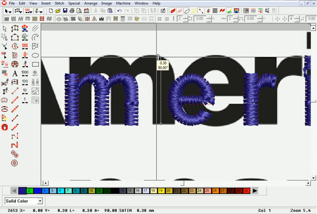
Machine or hand, some fundamentals cross over no matter what:
-
Pick the right stabilizer type: Cut-away for stretchy knits, tear-away for wovens. Get this wrong and your letters will pucker like a bad first draft.
-
Match your needle: to fabric weight and thread type. Fine needle for delicate stuff, heavier needle for denim or canvas.
-
Start small: a short monogram, not a full sentence.
-
Measure your lettering placement twice: We've eyeballed it before and regretted it. More than once.
How To Embroider Thick Letters By Hand
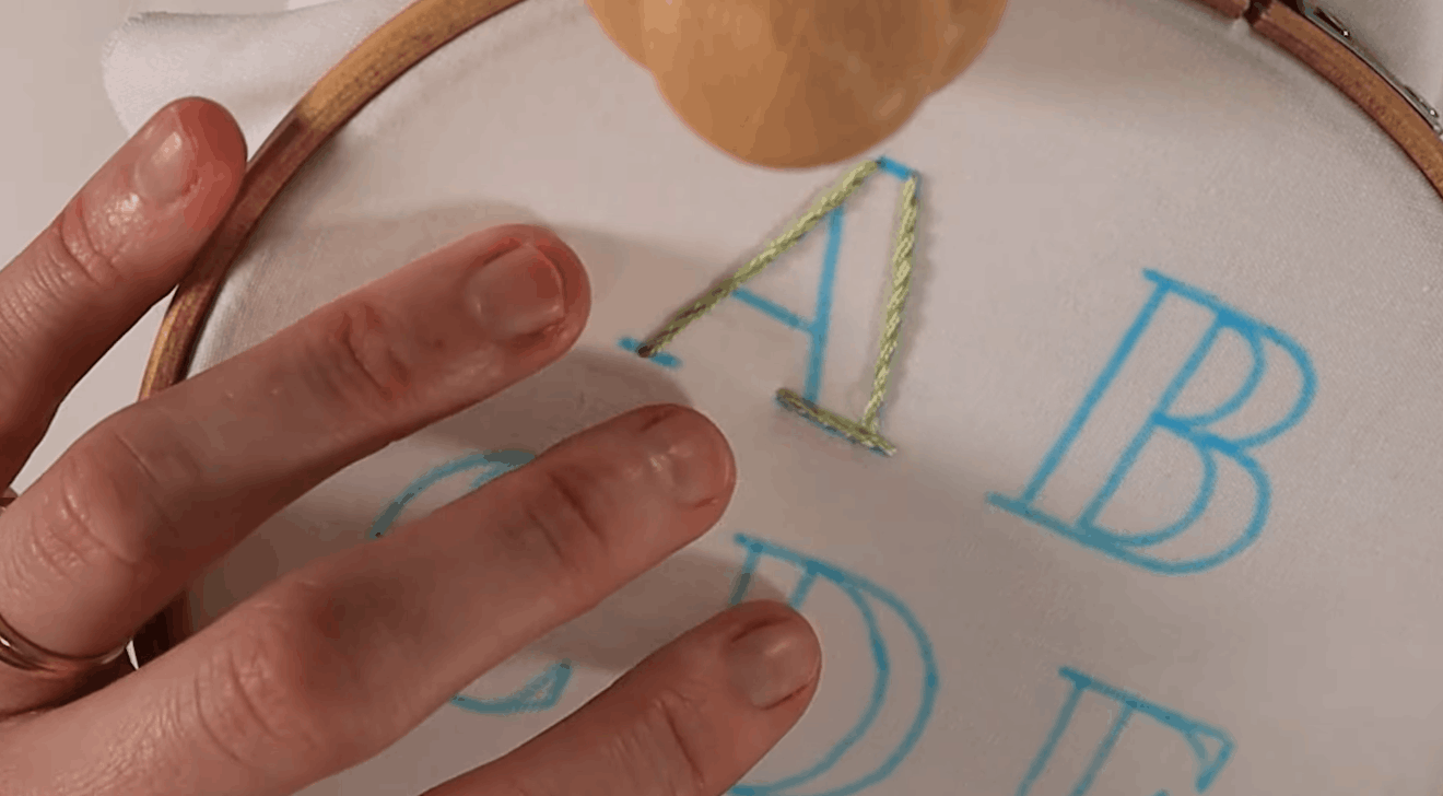
Thick, bold lettering, the kind you see in varsity-style monogram designs, usually means satin stitch by hand: rows of straight stitches worked side by side tightly across the letter's width.
Keeping it neat:
-
Outline first: Backstitch or split stitch gives you a clean edge to fill against.
-
Fill in with satin stitch: Parallel rows, close together, no gaps.
-
Add padding underneath: If you want that raised, dimensional look, the kind that catches light nicely under a store display.
-
Trim stray threads as you go: Don't wait till the end. You'll forget half of them.
How To Turn Hand Lettering Into Hand Embroidery
-
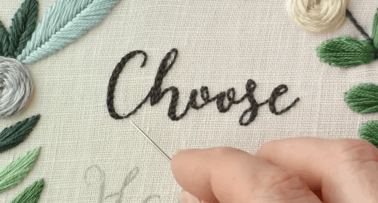
Transfer your lettering onto fabric using a lightbox, transfer pen, or tracing paper pressed hard enough to leave a mark.
-
Simplify delicate flourishes. What looks stunning in ink can turn into an unstitchable mess at small scale. Ink forgives. Thread does not.
-
Match stitch type to line weight, thin lines get backstitch or stem stitch, thick strokes need satin.
-
Save the connecting strokes for last in cursive-style work, so they tie the whole word together visually, like the glue holding a sentence's clauses in place.
How To Embroider Letters On Fabric
Fabric matters more than people expect, and it changes your whole approach:
-
Knits / stretchy fabric: Cut-away stabilizer, maybe heavier underlay too; otherwise, letters distort like a funhouse mirror.
-
Canvas or heavy denim: Often you can skip extra stabilizer entirely since the fabric's sturdy on its own, but bump up to a heavier needle.
-
Delicate fabric (silk, fine cotton): Lightweight water-soluble stabilizer, reduced stitch density, or you'll get puckering that looks like the fabric's frowning at you.
(For When You Just Want It Done)
Sometimes you don't want the full deep-dive. You want results, now-ish:
-
Stick with pre-digitized keyboard fonts. Skip custom digitizing for now.
-
Keep lettering between 4mm and 8mm, safely inside that golden zone we mentioned earlier.
-
Use tested, quality designs; this is genuinely where working with an established embroidery digitizing service (hi, that's us, at EMBpunch) saves hours of trial-and-error headache.
-
Always, always test-stitch on scrap fabric matching your real garment first. Always.
Is There a "How To Do Text Embroidery PDF" Worth Downloading?
We get this question constantly. And look, a PDF cheat sheet can be genuinely handy. Something to pin up near your machine with sizing minimums, needle charts, stabilizer notes scribbled in the margins. But, and we mean this, text embroidery is a hands-on craft. No PDF, however detailed, replaces actually stitching samples and watching thread react to different garments in real time. Treat any downloadable guide as a starting point. Not the whole education. Never the whole education.
Wrapping This Up
If digitizing your own text feels like more than you want to take on right now, or you just need clean, dependable files fast for a client project that's due yesterday, well, that's genuinely what we do, day in and day out, at EMBpunch. We handle custom patches, iron-on designs, and embroidery digitizing services for apparel decorators all across the US, and text-heavy logos make up a huge chunk of what crosses our desks.
Either way, grab some scrap fabric, pick one simple word, and just start stitching already. That's genuinely the only way any of this ever starts making sense. Trust us on that one.
Frequently Asked Questions
What digitizers can handle small font embroidery well?
Find a digitizing service with real, hands-on experience in small lettering specifically; sub-4mm text demands careful pull compensation, minimal underlay, and a lot of trial runs. It's a specialty within a specialty, if that makes sense. At EMBpunch, small text and fine detail work is bread-and-butter stuff for us, something we handle regularly for apparel decorators across the US.
How small can embroidery text realistically go?
About 1mm to 1.2mm is the safe floor for most fonts and fabric types. Push smaller and you're increasing your odds of thread breaks, illegible letters, and general frustration.
Do I need special software to digitize text myself?
Yes, pretty much. Wilcom, Hatch, programs like that are industry standard, and they come loaded with keyboard fonts that simplify text digitizing enormously compared to hand-building letters from zero.
What's the best stitch type for embroidered lettering?
Satin stitch for most letters under roughly 10–11mm wide. Fill stitch for anything larger, long satin stitches get impractical fast, prone to snagging on everything nearby.
Can I embroider text without an embroidery machine?
Absolutely, yes. Free-motion sewing machine work and hand embroidery (backstitch, satin stitch) both handle lettering fine. Just requires more manual control, more patience, more coffee probably.